Branding Guidelines
Color usage
Brand Primary Color
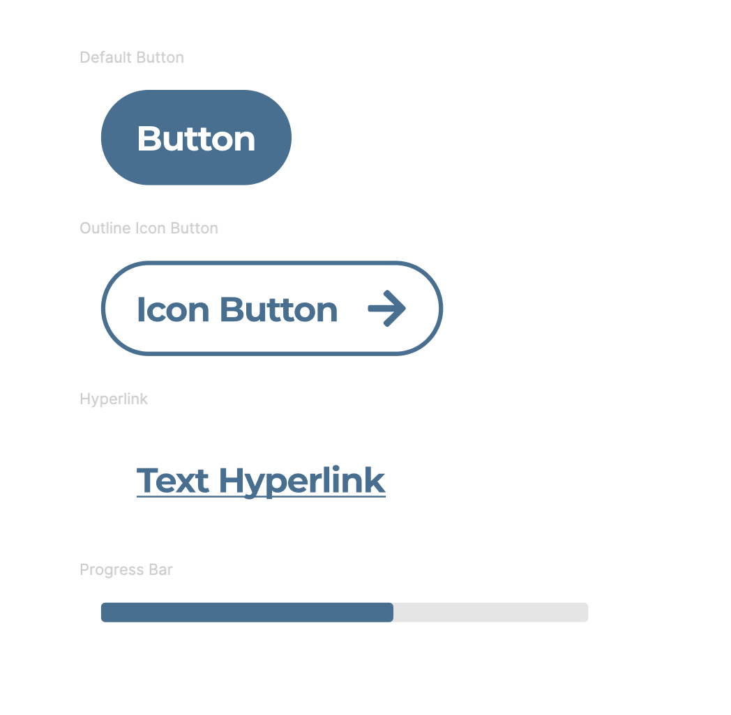
Please provide a hex value of your brand’s primary color. This color will be used on button treatments, hyperlinks, progress bars, and many other primary UI elements. Please ensure this primary color follows web accessibility guidelines and has a contrast ratio of 4.5:1 or better (7:1 is most ideal). This tool (https://webaim.org/resources/contrastchecker/) will help you select the proper primary color. Lighter colors will run the risk of a poor user experience.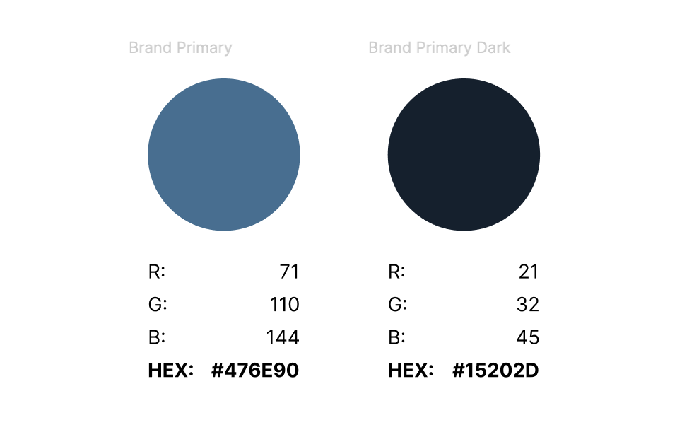
Logo Guidelines
Below is an example of a logo using our standard 3:1 aspect ratio.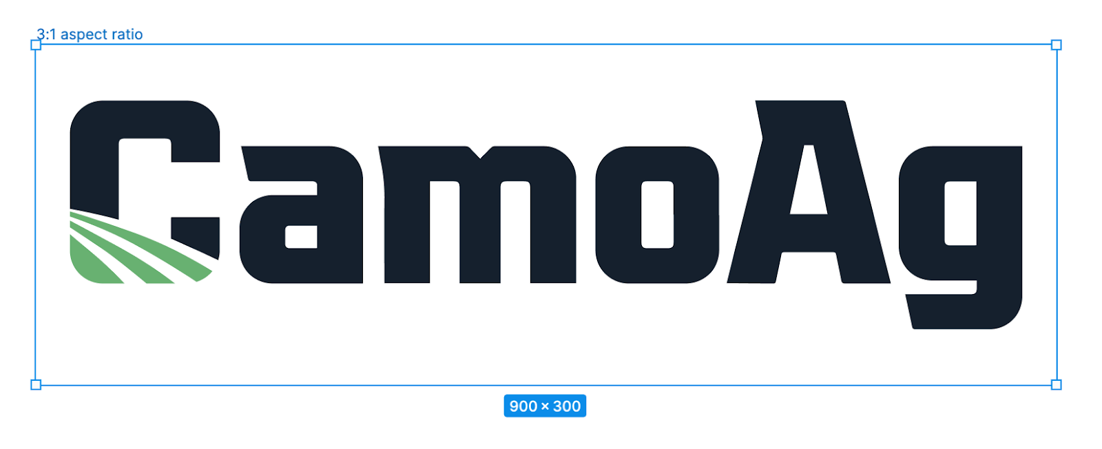
Do’s & Do Not’s
Do:- Adhere to the 3:1 aspect ratio
- Provide a logo that presents best on a white or light background
- Horizontally AND vertically center your logo on the 3:1 aspect ratio canvas
- Provide some clearspace around the logo to prevent overcrowding
- ONLY use scaling to fit the logo on the canvas
- Provide a logo with a minimum of 600x200 pixel dimensions
- Provide the logo in a .SVG file format
- Provide a logo with a transparent background.
- Stretch, skew, or distort the logo to fit the canvas, scale only
- Change brand colors in the logo
- Rotate the logo
- If the logo has a logomark, do not rearrange unless using a company-approved brand logo
- Provide a logo in any file format other than .SVG
- Provide a logo without a transparent background.